CP Company - Loyalty program
CP Company, Lugano, Switserland
June 2025
C.P. Company’s loyalty program, The Brotherhood, was underperforming—mainly because customers didn’t know it existed or didn’t see a reason to engage. In a 4 week sprint, we uncovered key issues: lack of clarity, weak visual hierarchy, and a tone that didn’t reflect the brand’s identity or community spirit. We redesigned both the landing page and dashboard with a clearer structure, more direct messaging, and a user-focused tone. Key loyalty information is now easier to scan, progress is more visible, and calls to action are more compelling. By grounding every design decision in user research and business context, we created a loyalty experience that not only informs—but motivates.

Project Overview
Our Approach & Methodology
Team structure & collaboration framework
Working with my colleague Frankie, we established a collaborative framework that leveraged our complementary strengths. Frankie brought high energy and visual design expertise, while I contributed research depth and strategic grounding.
Our collaboration process
Daily check-ins to maintain alignment and share progress
Structured project management via Notion to track deliverables
Divided work based on strengths while maintaining joint decision-making
Professional conflict resolution when we disagreed on approaches
4-Week sprint timeline
Week 1: Foundation & Alignment
Stakeholder interview and project kickoff
Secondary research and competitive analysis
Heuristic evaluation of current program
Research methodology planning
Week 3: Strategic Direction
Affinity mapping and insight consolidation
Problem statement refinement
Ideation and strategic planning
Design direction setting
Week 2: Deep Discovery
Survey deployment and user interviews
Expert interview with retention specialist
Data synthesis and pattern identification
Persona development
Week 4: Execution & Delivery
Interface redesigns and usability improvements
A/B testing via Maze platform
Research report compilation
Final presentation preparation
Research & Discovery
Research decisions
Why we chose mixed methods: We decided on a combination of quantitative and qualitative research because the stakeholder interview revealed alignment between our initial assumptions and their internal concerns. This gave us confidence to pursue deeper user understanding while validating hypotheses with broader data.
Expert interview rationale: After our initial user interviews consistently showed program awareness issues, Frankie and I discussed whether to include retention marketing experts. We decided this would strengthen our recommendations by learning from successful loyalty programs in other industries.
Secondary research insights
A 2021 McKinsey survey found that 65% of customers are more likely to increase how often they buy from a brand when they're a member of its loyalty program. This validated the strategic importance of fixing CP Company's program.
Competitive analysis revealed: Successful fashion loyalty programs focus on community building and exclusive experiences rather than just discounts—a key insight that influenced our solution direction.
Heuristic analysis: identifying core issues
We conducted a systematic heuristic evaluation using Nielsen's 10 usability principles. This method was chosen because it would quickly identify obvious usability barriers before conducting user research.
Key findings
Unclear value proposition: The name "The Brotherhood" doesn’t communicate it’s a loyalty program.
Cognitive overload: Users have to remember tier details instead of seeing side-by-side comparisons.
Visual hierarchy issues: Three fonts in five sizes created confusion.
Ambiguous CTAs: "Read More" labels didn't indicate what would happen when clicked.
Decision point: These findings influenced our interview questions—we specifically probed about program awareness and navigation confusion.
A couple things stood out to us
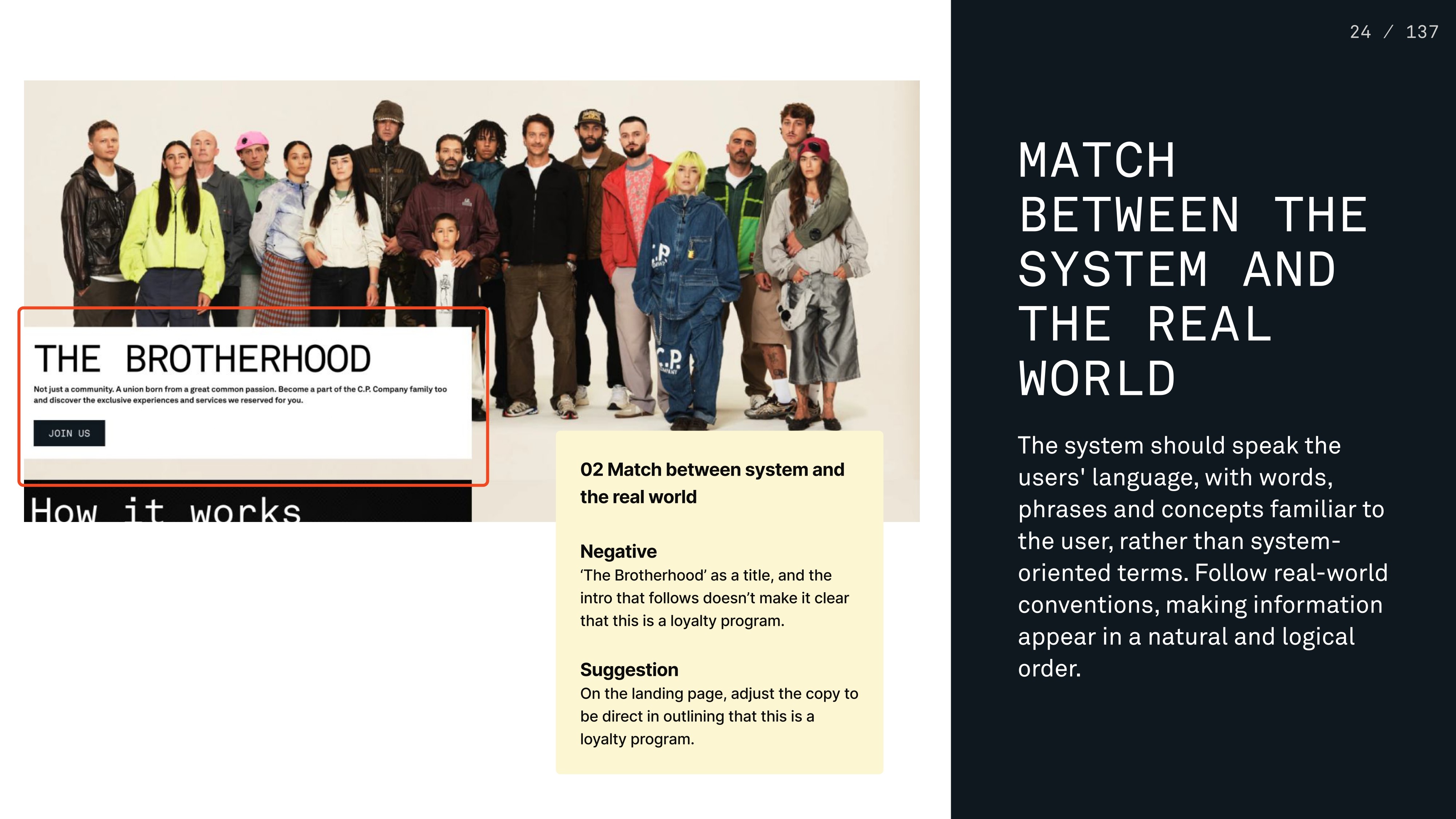
1 Heuristic: Match between the system and the real world
The name The Brotherhood and the accompanying text don’t clearly communicate that this is a loyalty program. For new users, it’s unclear what the offering is or why they should care.
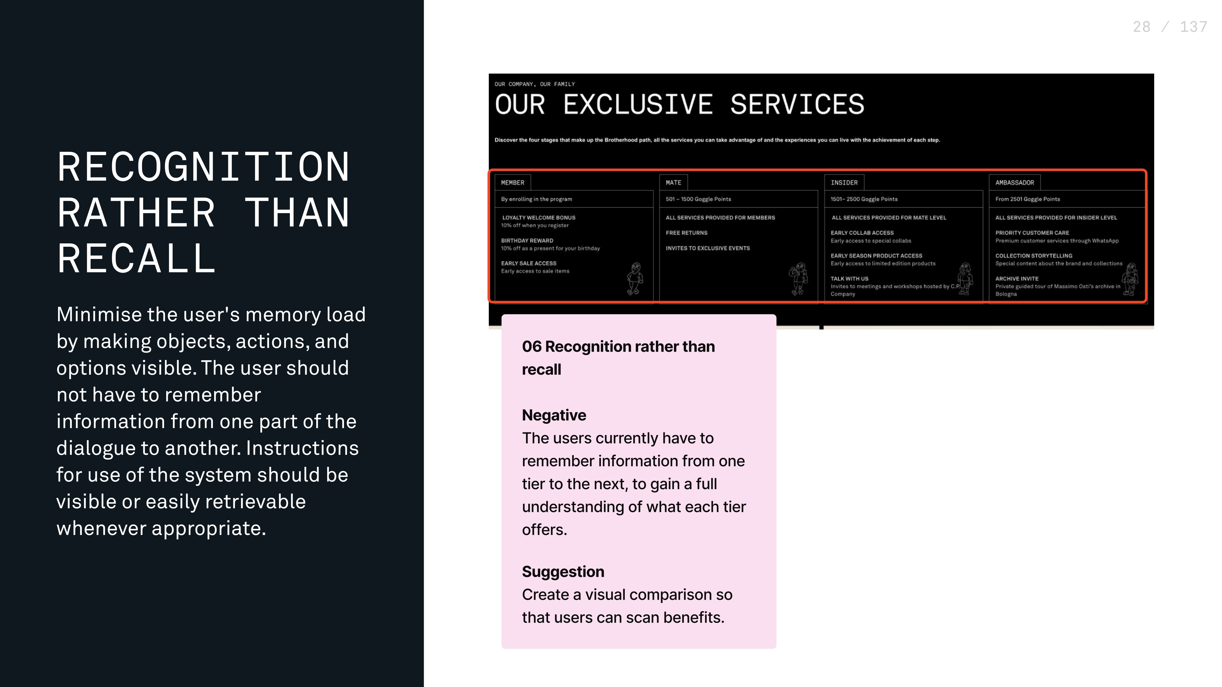
2 Heuristic: Recognition rather than recall
Users have to remember details from previous tiers to understand what each one offers. The information isn’t presented side by side, which makes comparison harder and increases cognitive load.
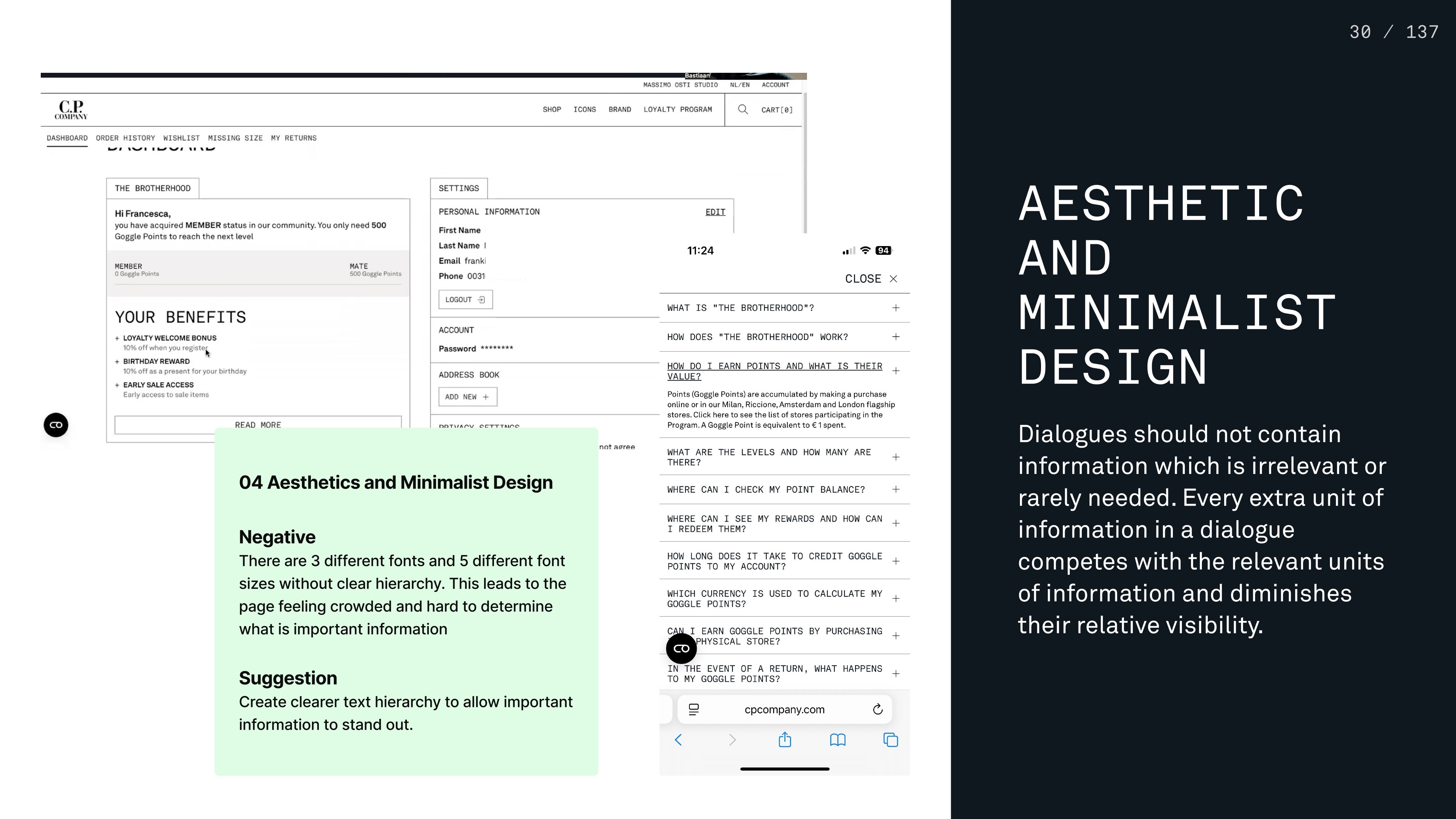
3 Heuristic: Aesthetic and minimalist design
The page uses three fonts in five sizes and varying weights, without a clear visual hierarchy. This creates visual clutter and makes it hard to identify the most important information.
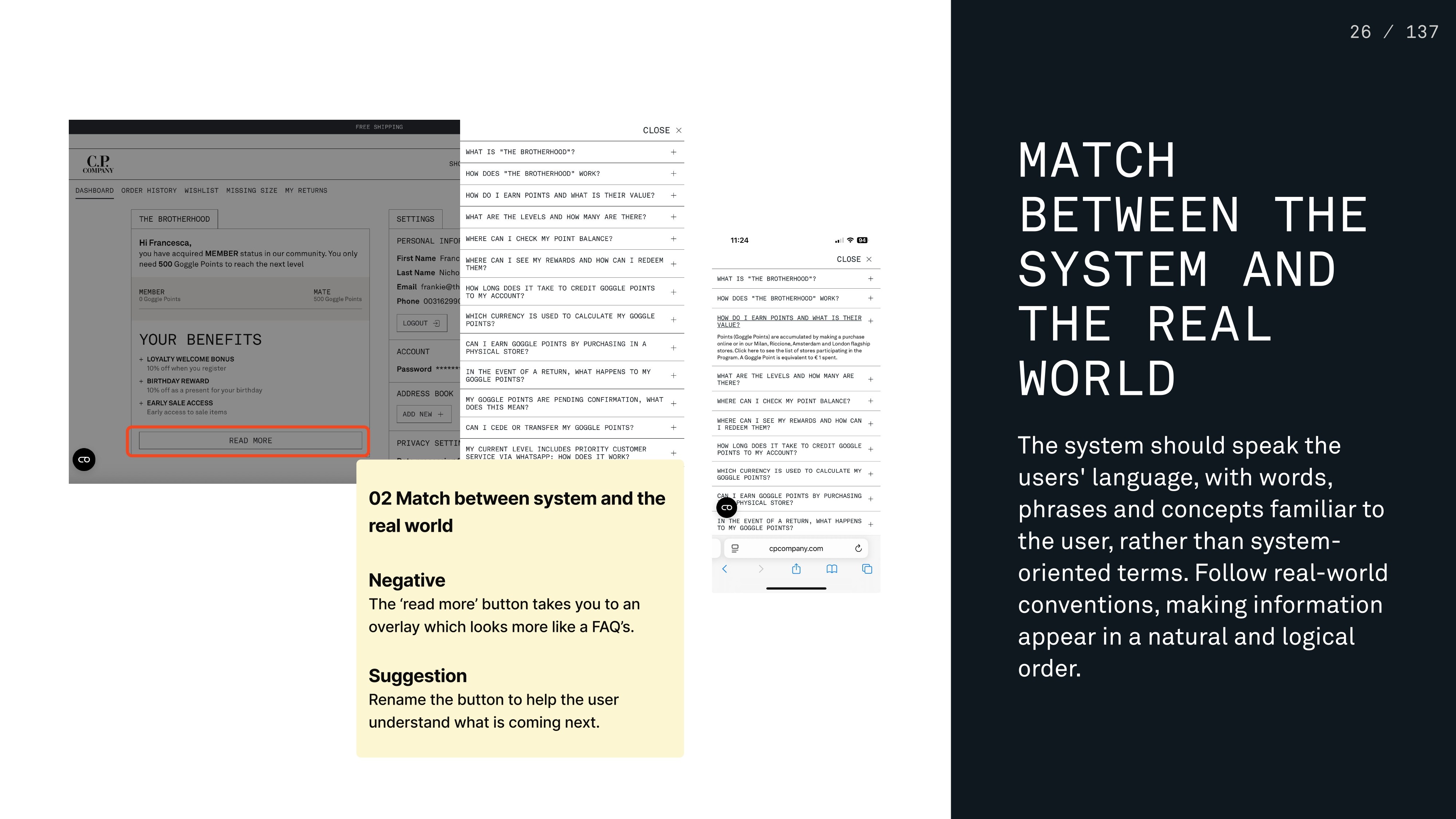
4 Heuristic: Match between the system and the real world
The label READ MORE doesn’t clearly indicate what will happen when clicked. It opens an overlay that functions more like a FAQ section, which isn’t obvious from the wording.
User research: uncovering the real problem
Out of 47 participants, 30 (64%) said they were not aware of The Brotherhood—the loyalty program.
This validated out hypothesis about awareness issues.
User interviews (7 participants)
We aimed for 8 interviews based on research showing diminishing returns after 6-8 interviews for usability insights. We conducted 7 in the end, plus our time constraints required focusing on quality over quantity.
Collaboration approach: we evenly divided the interviews. Switching each interview between being the interviewer or note taker.
Key insights
Participants expressed that they want to feel more than just a data point. If they are signing up they want to receive benefits that non members don’t have.
“If I'm going to be signed up, I'd expect to have the benefits of someone that isn't signed up.” - User 2
Participants said their personal relationships with CP Company staff keep them coming back, yet they noted that other brands rarely foster such human connections.
“The way they involve you, make you part of the community, that works. That really works. That makes me stay loyal to the brand” - User 4
Several participants formed real-life friendships through their connection to CP Company, showing how a shared love for the brand can foster community. A clear opportunity for the loyalty program to move beyond transactions and build deeper social ties.
“I treat those stores as a kind of extension of my friendship network, if you like.” - User 5
Expert interview: strategic validation
Why retention experts: We interviewed a professional from HelloFresh to understand loyalty program best practices beyond fashion retail.
Key learning: "It can't be for everyone. Not everyone wants to engage with the brand in the same way. It should be more for the real fans out there."
This insight was pivotal—it validated our hypothesis that CP Company should focus on brand enthusiasts rather than broad market appeal.
Solution development
Ideation & decision-making process
Collaborative ideation: During our ideation session, we had a professional disagreement about the seriousness of the process. I initially felt we already knew what to redesign, but Frankie insisted on proper ideation methodology. After discussion, we committed to thorough ideation, which actually generated new directions and strengthened our final solution.
Strategic decisions made
Focus on community over discounts based on user feedback
Target brand enthusiasts following expert interview insights
Honor heritage as differentiator from competitors
Dual-timeline approach providing quick wins and long-term vision
Affinity mapping: finding core themes
Working together (with Frankie starting while I attended another meeting, then finishing jointly), we identified four core themes:
Community: Desire for belonging and connection
Connection: Personal relationships with brand and staff
Engagement: Meaningful interactions beyond transactions
Personalisation: Tailored experiences that recognise individual preferences
Decision impact: These themes became our design principles and guided all subsequent solution development.
Design strategy & execution
Work division rationale: In the final week, we strategically divided work based on our strengths. Frankie focused on visual redesign while I compiled the research report. We maintained alignment through three daily check-ins and mutual feedback on each other's work.
Key design decisions
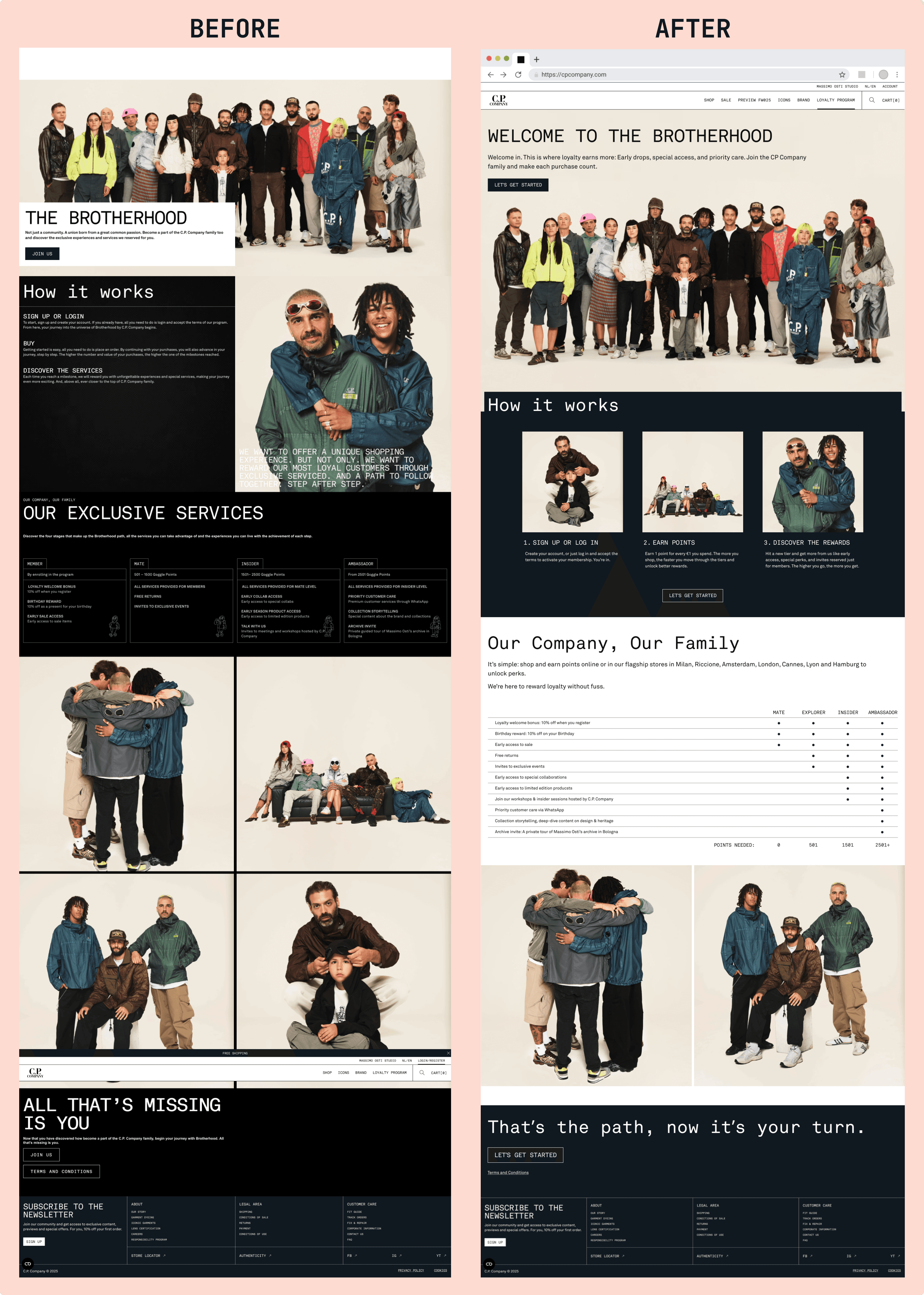
Landing Page Redesign
Clearer value proposition: Made loyalty program purpose obvious from first glance
Improved hierarchy: Simplified visual design with consistent typography
Stronger CTAs: Emphasised "Let's get started" over terms & conditions
Enhanced hero section: Extended image upward with layered text for immersion
Below is a side-by-side comparison of the original and our updated design.
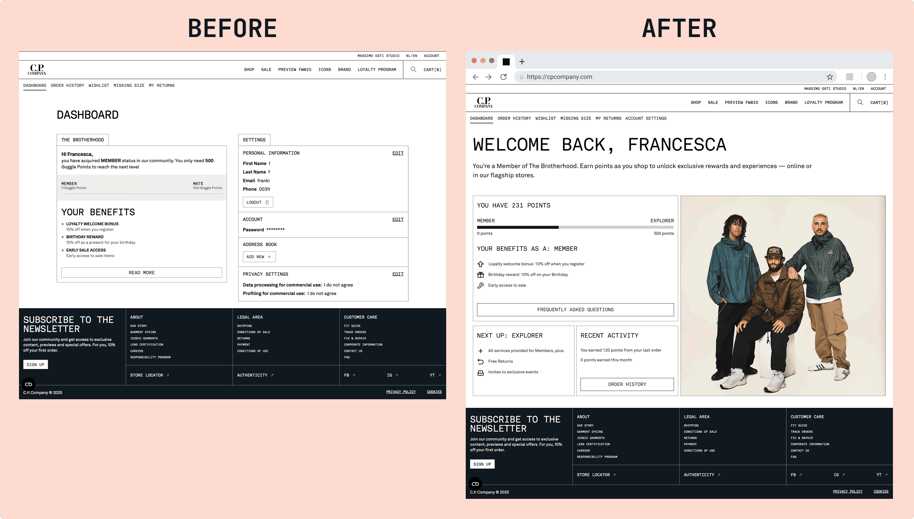
Dashboard Redesign:
Separated navigation: Moved dashboard to its own tab for clarity
Progress emphasis: Made current points and next-tier preview prominent
Western reading patterns: Restructured layout for left-to-right, top-to-bottom scanning
Reduced cognitive load: Eliminated need to remember information between sections
Below is a side-by-side comparison of the original and our updated design.
Testing & validation
A/B testing decision: We chose to test our redesigned elements through Maze to validate improvements before final delivery. This added credibility to our recommendations.
Results: User testing showed 47% initially thought "Read More" would show additional benefits, while 36% assumed it would expand personal info. Our redesign eliminated this confusion through clearer information architecture.
Results & impact
Immediate deliverables
Research artefacts:
Comprehensive research report with actionable insights
3 detailed personas representing different customer segments
Strategic presentation with implementation roadmap
Design solutions:
Redesigned landing page and dashboard with improved usability
A/B tested interface elements showing measurable improvements
Strategic transformation
Problem re-framing success: We successfully shifted stakeholder focus from "fixing program features" to "rebuilding brand intimacy." The client confirmed our research aligned with their internal intuitions, providing validation for strategic direction.
Stakeholder alignment: Vanessa (our primary stakeholder) expressed excitement about having clear direction and actionable recommendations. The alignment between our findings and their internal concerns built confidence in implementation.
Long-term foundation: Our research framework and personas provide CP Company with tools for ongoing customer understanding and program evolution.
Key learnings & insights
This project reinforced critical principles about user research and collaborative design. Our interviews validated awareness issues but revealed a deeper truth—the real problem wasn't program features but lost brand intimacy. Community connection beats discounts for lasting relationships, and heritage becomes a competitive advantage when leveraged authentically.
Working with Frankie showed how complementary skills create stronger outcomes. Her visual expertise and energy balanced my research depth and strategic approach. When we disagreed during ideation, addressing it professionally improved our results. Daily check-ins prevented misalignment, while managing team stress through supportive planning maintained productivity under tight deadlines.
Next steps & recommendations
Immediate implementation (quick wins)
Deploy redesigned landing page and dashboard interfaces
Implement accessibility improvements for EU compliance
Launch awareness campaign using research insights
Begin community-focused content strategy
Strategic development (long-term vision)
Conduct deeper user research for comprehensive program overhaul
Develop detailed customer segmentation strategy
Create heritage-focused engagement initiatives
Build measurement framework for community building success
Ongoing evolution
Regular user feedback collection and analysis
Iterative design improvements based on usage data
Expansion of community-building features
Integration with broader brand experience strategy
Conclusion
This project demonstrates how user research and collaborative design thinking can transform underperforming customer experiences. CP Company now has both immediate solutions and strategic direction for rebuilding the community connection that made their brand special.
The transformation from an invisible loyalty program to a community centered strategy shows the power of understanding real user needs versus assumed requirements. By honouring CP Company's heritage while meeting modern customer expectations, we created a foundation for sustainable loyalty that goes beyond transactions.
The client
C.P. Company is an Italian apparel brand founded in 1971 by designer Massimo Osti. Known as the “godfather of sportswear,” the brand has built a 50-year legacy in functional fashion.
Operating in the premium streetwear and functional fashion market, C.P. Company attracts customers who value innovation, heritage, and technical excellence. A loyal community has formed around its iconic goggle jackets and military-inspired designs.
The challenge
In 2022, C.P. Company launched a loyalty program called The Brotherhood to deepen customer relationships and boost engagement. But the program ran into trouble.
The surface problem: Low awareness and engagement. Most customers don’t know The Brotherhood exists. Those who do rarely interacted with it.
The deeper issue: Our research revealed the brand had lost its intimate connection with long-time customers who felt abandoned as CP Company shifted from personal store relationships to mass retail. The loyalty program tried to appeal to everyone instead of focusing on brand enthusiasts, creating a generic experience that failed to leverage the brand's rich heritage.


Portfolio