Designing trust and clarity for a sensitive e-commerce experience.

Challenge
Ribogrow’s existing website lacked structure and clarity. Users struggled to understand the science behind the products and had difficulty navigating the web shop. We were tasked with:
Our brief simplified in three actionable steps — 1. Optimise user experience. 2. Improve product education & 3. Increase customer engagement.
Optimise user experience
Improving mobile responsiveness and accessibility
Increase customer engagement
Through early research, we discovered an added layer of complexity — scepticism around product claims. While the stakeholder emphasised strong marketing to drive sales, users needed honest, digestible information to build trust. This tension became central to our UX decision-making.
Research
To better understand user needs, we launched a survey and conducted 5 in-depth interviews with both people experiencing hair loss and those who weren’t. Our goal was to uncover how users research pharmaceutical products online and what builds — or breaks — their trust.
Our research confirmed key assumptions:
Hair loss is a sensitive topic.
Users are sceptical of bold claims.
People rely heavily on peer reviews and do a lot of self-research.
Interviewing wasn’t always easy — some participants were hesitant to open up. These moments required more than just prepared questions — they required empathy, active listening, and the ability to read the room. We often adjusted our approach on the spot, rephrasing questions and creating space for open dialogue.
“I didn’t want to lose [my hair] so early… it was really frustrating for me”
Long days and “afternoon brain” fatigue pushed us to restructure our workday: deep, creative tasks in the morning, lighter ones in the afternoon. This shift significantly improved our focus and pace.
Synthesis & Ideation
We began synthesising our data with an affinity map, combining our manual observations with insights generated through AI tools. This helped us cluster patterns around four key themes:
<aside>
Acknowledgment of emotional impact
Clear education and support
Setting realistic expectations
Building user trust </aside>
From there, we crafted a clear problem statement, but initially, we felt a bit directionless — like we were designing just another web shop.
User’s problem
Our problem statement: describes our problem in three simple steps. 1 User Description, 2 Goal, 3 Insight.
It wasn’t until we created four focused How Might We statements that things clicked into place. These became our North Star, giving clarity to our design purpose and helping us balance user needs with business goals.
The HMWs influenced everything — from content strategy to user flows and feature prioritisation. Without them, we would’ve missed the real design need entirely.
How might we build trust in the product without making unsupported medical claims?
HMW guide users through the science without overwhelming them with jargon?
HMW maintain user interaction throughout the ribogrow trial period?
HMW help users compare ribogrow with other options on the market (without directly naming competitors?)
User Persona & Flow
To ground our thinking, we each created a user persona — then merged insights to develop two final profiles. Given time constraints, we focused our design on Finn, our primary persona.
“I just felt like… I had to try something, even if I didn’t know if it’d work.”
Our goal for Finn’s journey was simplicity: understand the product and science clearly, then transition to purchase without friction. Every screen in the user flow supports that streamlined experience. Have a closer look at our flow in the image below.
The simplified User Flow — designed for a friction less shopping experience.
Design Process
We started with low-fidelity wireframes to quickly test layout ideas and basic flows. After early feedback, we moved into mid-fidelity designs, taking extra time to refine the structure and content placement — this helped us avoid major changes later.
It took patience to resist jumping into the visual stage too early. We learned to make deliberate decisions, not just pretty ones.
With a solid foundation, we transitioned into high-fidelity design, focusing on visuals, accessibility, and consistency. Each stage built on the last, making the process smoother and more intentional.
During testing we switched to a mobile first approach. As you can see, low-fi started out as a desktop, but because mobile is so important these days, we thought it best to start from mobile first, in mid-fi and hi-fi.
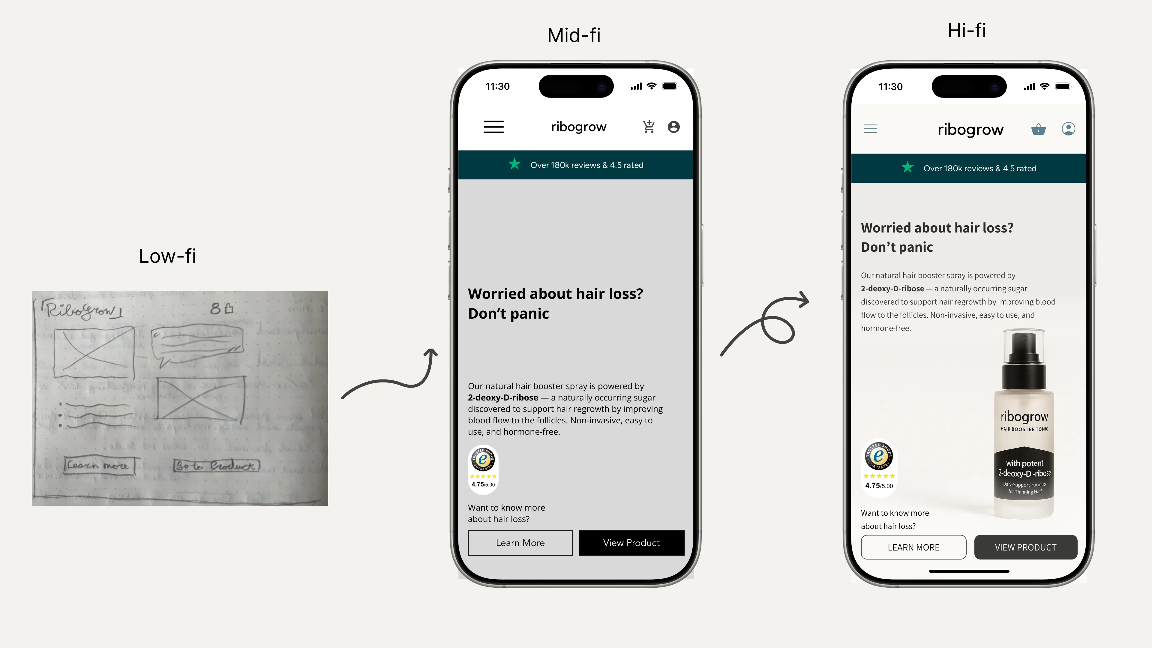
A visual progression of a mobile design from low-fidelity to high-fidelity for ribogrow’s landing page.
In the high-fidelity stage, we polished the visuals, ensured accessibility, and brought everything together. We tested continuously across stages, iterating on user confusion around categories and post-purchase care.
Our final testing showed marked improvements in:
Comprehension of product benefits
Ease of use in the shopping flow
Overall trust in product information
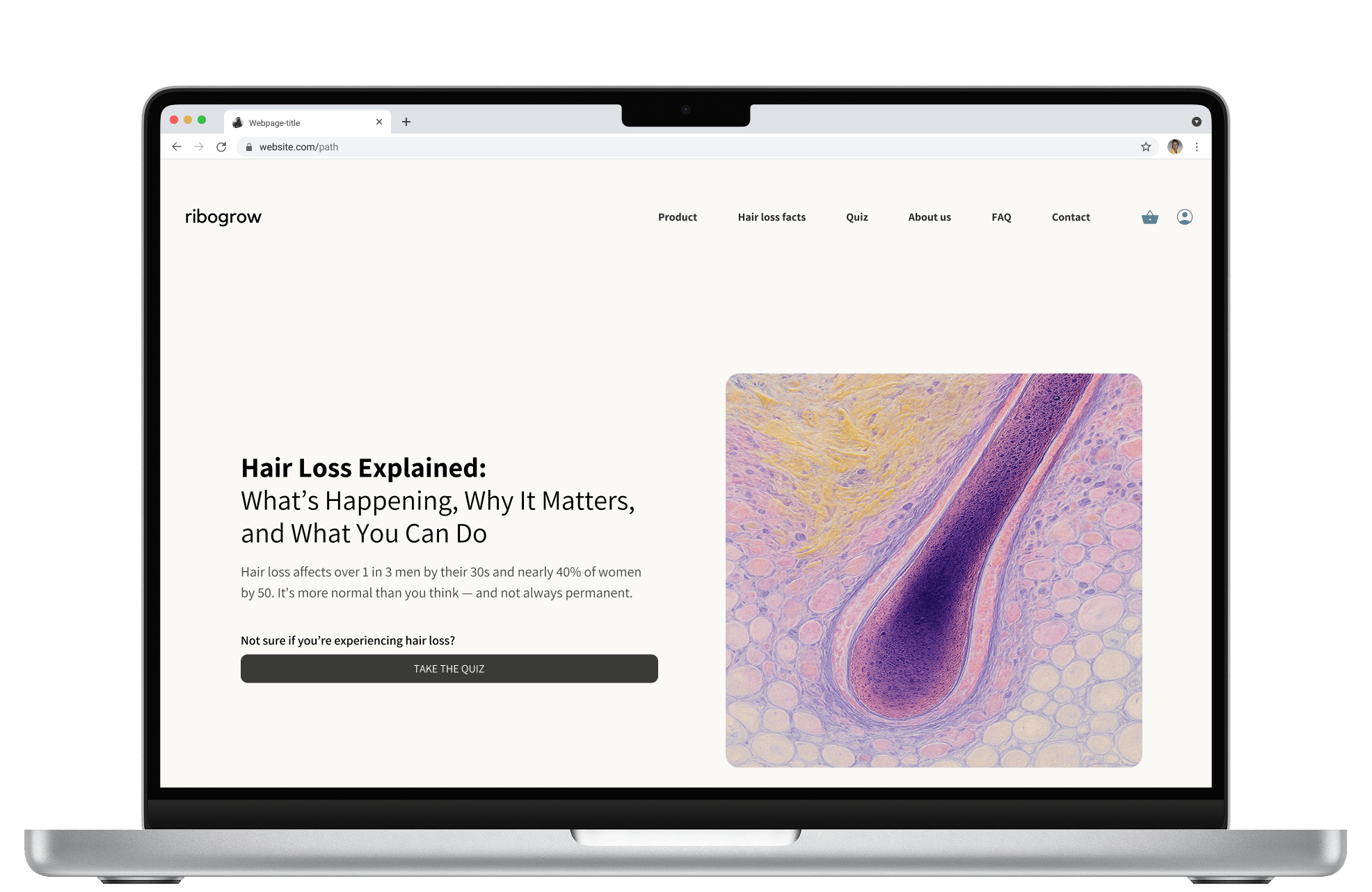
A brief look at our website prototype on desktop.
Design implemented by the client
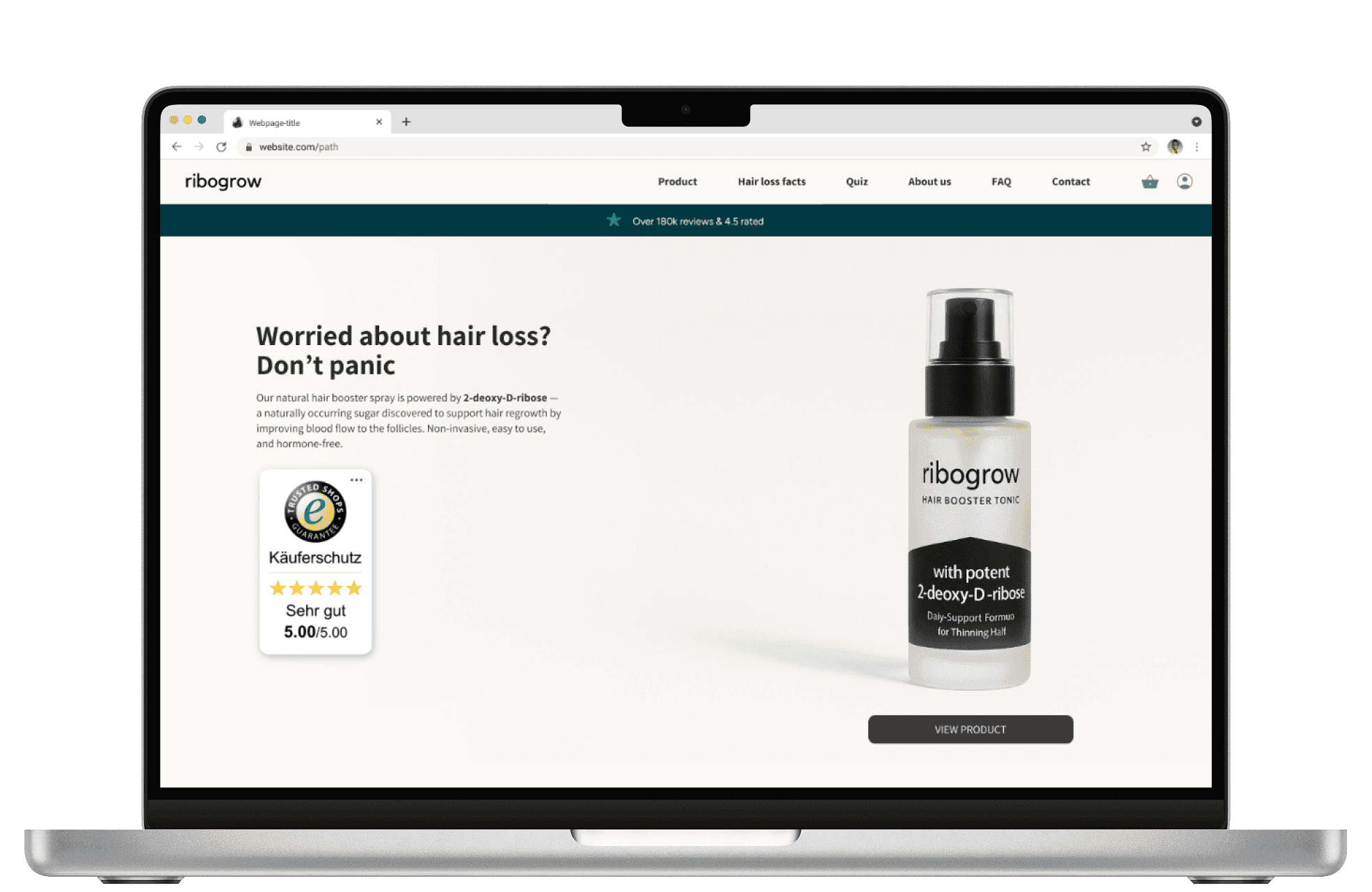
We were excited to see that ribogrow adopted several of our key design features within just a month of completing our sprint. It’s always rewarding to see our work making an immediate impact.
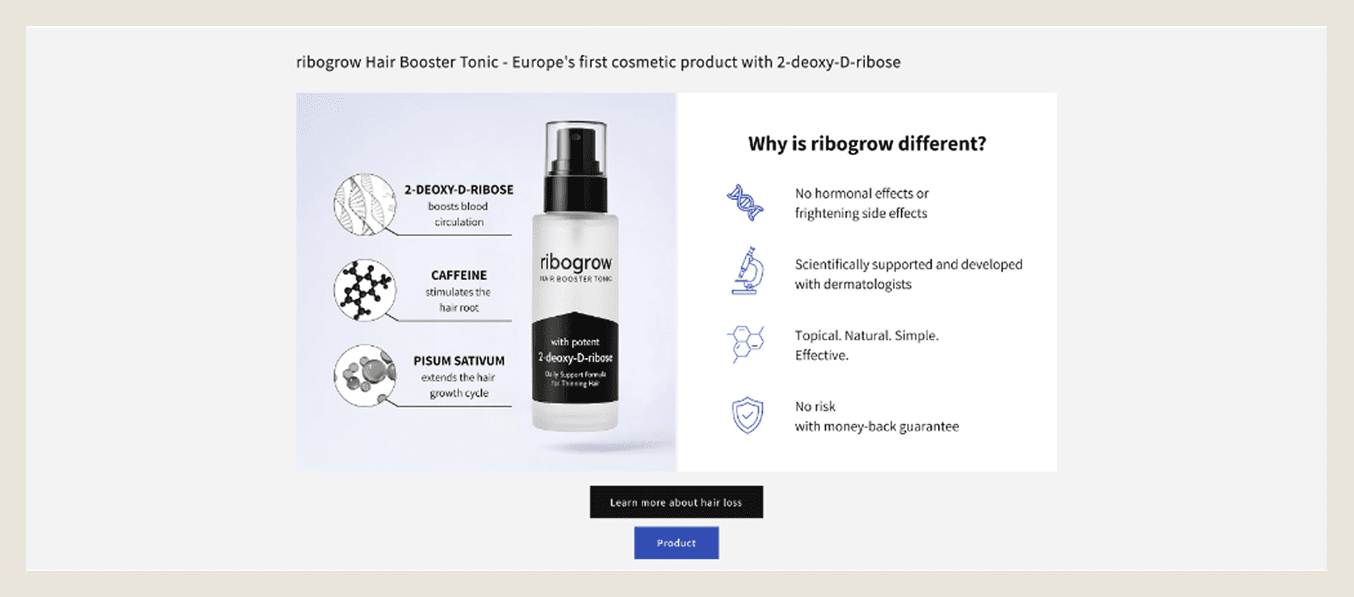
Take a look at the screenshots below to see how our designs were brought to life on ribogrow’s live site.
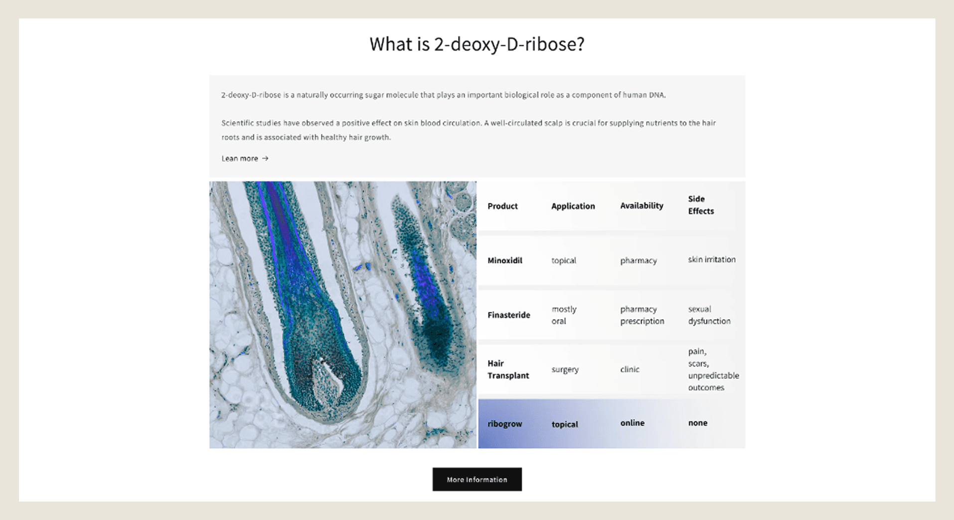
Clearly explaining how the product’s active ingredients work, and what sets it apart from other solutions on the market.
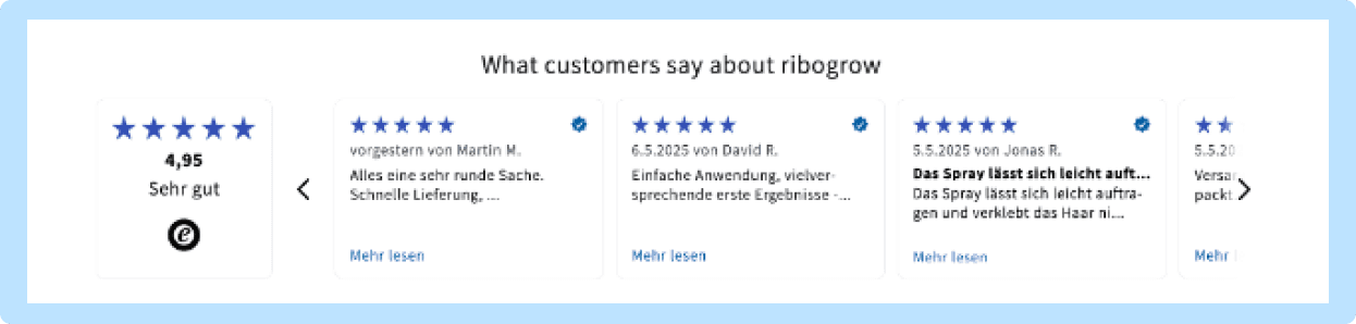
Integrated Trusted Shops, a third-party review platform, to build credibility through verified customer feedback.
Positioned the product within the market to build trust through transparency, by showing how it works and how it compares to other solutions.
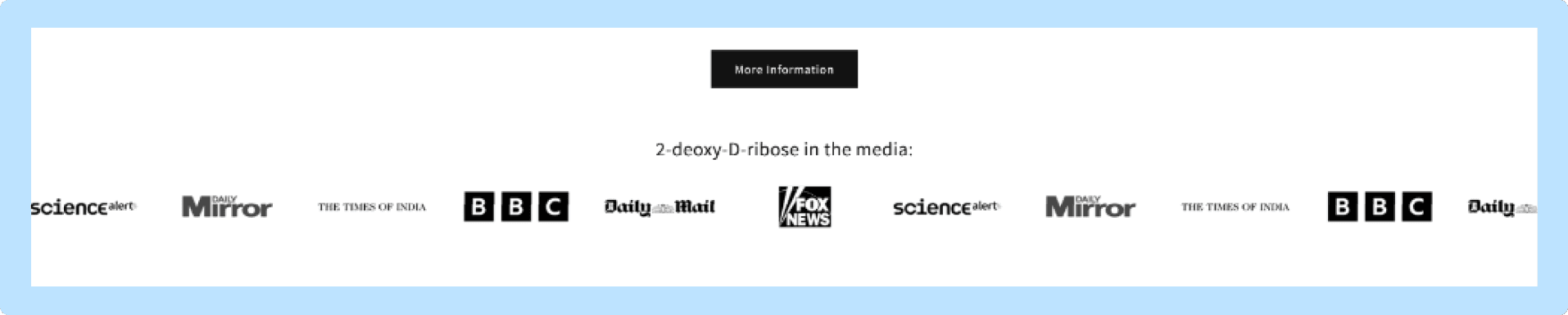
Small tweaks can make a big difference. We suggested explaining why well-known media outlets are featured, since they link to articles about 2-deoxy-D-ribose, it’s a great opportunity to add context and credibility.
What I learned
Working with James felt collaborative from day one. We divided tasks based on strengths — James focused on component design and visual detailing, while I concentrated on research, flow, and storytelling.
We challenged each other's ideas constructively, making feedback exchanges a natural part of our process. This helped us refine our thinking faster. Regular check-ins and mutual respect kept our work aligned and efficient. Our shared business background helped us balance user needs with stakeholder priorities.
A key lesson was the value of taking time with mid-fidelity design. Unlike previous projects where we rushed this stage, we gave it proper attention. This thoroughness made the transition to high-fidelity smoother and strengthened the reasoning behind our design choices. It reinforced that foundational structure is crucial — a polished visual design is only as good as the thinking behind it.
Managing my energy and focus proved as crucial as managing Figma layers. The project taught me that working smarter often means knowing when to step back.
This project synthesised everything we learned in the bootcamp. It offered real experience with stakeholder challenges, and I discovered my passion for the entire process — from initial problem framing through to user centred design decisions.