Recharge App - “making rest days as fulfilling as workout days”

Intro
This case study showcases my fourth project at Ironhack’s UX/UI Design boot camp, where my teammate James and I were tasked with developing a niche product for the Daily Health Conference.
Context The Daily Health Conference, a global non-profit, has long promoted wellness through talks, workshops, and training. However, as digital tools reshape health and fitness, the organisation recognised the need to modernise. This project aimed to bridge that gap by creating a digital solution that encourages balanced fitness habits while aligning with modern UX best practices.
The Problem The Daily Health Conference has experienced a significant decline in membership. To address this, they are seeking ways to offer more value to their members and enhance engagement. One key area they identified is helping people adopt and maintain a sustainable, health-enhancing routine.
Project Requirements
Redefine how users adopt and commit to a healthier routine.
Focus on any wellness aspect, fitness, nutrition, meditation, time management, or medicine.
Track progress and encourage sustainable habits.
Ensure GDPR compliance, giving users full control over their data.
Design a modern, user-friendly interface that reflects the Daily Health Conference’s values.
Niche
To define our niche, we focused on creating a tracking app that provides insights into how physical activity impacts mental well-being.
We began with the following hypothesis
By developing a tracking app that helps users see how their physical activity affects their mental well-being, we can encourage sustained engagement in exercise for better mental health.
Research
Conducted a survey with 77 respondents, out of which we conducted 7 user interviews.
To ensure our solution addressed real user needs, we conducted both quantitive as qualitative research.
Surveys: We gathered responses from 77 participants to understand their fitness and rest habits. While 91.9% acknowledged that exercise improved their mood, 62.2% did not actively track their mental well-being, revealing a gap in existing tools.
👉 Insight: While users understood that exercise positively impacts their mood, they rarely measured their emotional state, making it easy to overlook this. This gap revealed an opportunity to make emotional tracking part of their routine.
Interviews: We conducted 7 in-depth interviews to gain qualitative insights. A recurring theme was the emotional toll of missing workouts, with many participants associating rest days with guilt rather than recovery. Several interviewees also reported overtraining, leading to injuries and burnout.
👉 Insight: Rest was seen as a necessary evil rather than a valuable part of training, leading to cycles of injury and frustration.
Competitive Analysis: We examined popular fitness apps and found a strong focus on performance tracking but little emphasis on celebrating rest and recovery. This gap presented an opportunity to create a solution that reframes rest as a key part of progress.
👉 Insight: The fitness industry rewards consistency and intensity, but few tools exist to help users balance their physical and mental well-being.
The research identified three major pain points within fitness culture
Guilt over missed workouts: Many users felt pressure to maintain consistency at all costs.
Rest perceived as lost progress: Recovery days were often seen as a setback rather than a necessary part of training.
Overtraining leading to burnout: Pushing beyond limits resulted in exhaustion and injuries.
Despite gathering all those valuable insights, we initially struggled to break free from conventional fitness app structures. We found ourselves unconsciously replicating existing solutions rather than innovating. To shift our thinking, we conducted a ‘Worst Ideas’ exercise — brainstorming deliberately bad concepts to challenge our assumptions. The outcome of which you can see in the image above. This exercise helped us break free and explore new directions.
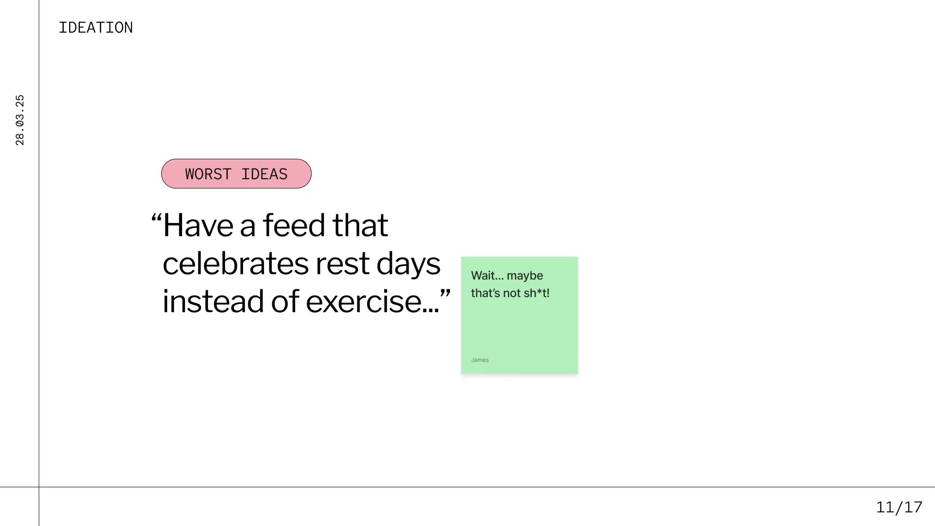
💡 What if rest was the goal, not the compromise?
This realisation led us to focus on re-framing rest as a vital part of the fitness journey rather than a failure. Our target audience consisted of fitness-conscious individuals prone to overexertion.
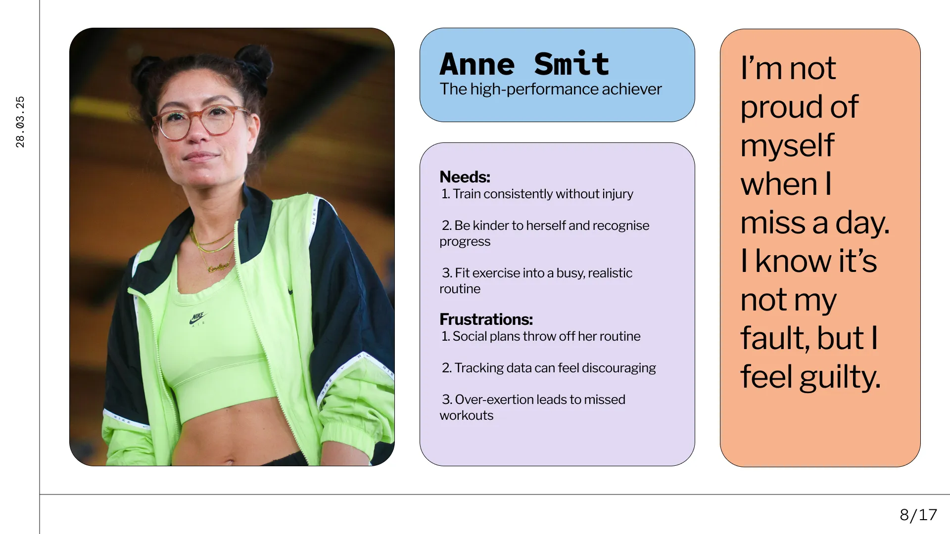
To ground our design in real user needs, we developed our primary persona, Anne Smit, a high-achiever struggling with workout guilt and injury. By centring our design around Anne’s pain points, we ensured that our solution addressed a clear and pressing need.
Testing
To refine Recharge’s features, we conducted multiple rounds of usability testing with key takeaways:
Simplicity matters: Users preferred a clean, intuitive interface over complex tracking systems. Cluttered designs caused frustration, making navigation a key priority.
Positive reinforcement works: A key insight was how positively users reacted to the idea of celebrating rest. One tester said:
“It’s the first time I’ve seen an app tell me it’s okay to take a break.”
Encouraged by this, we emphasised rest-day sharing in the user flow and added a feature to reflect on how rest impacts mood. These iterations helped align the product more closely with user expectations and emotional needs.
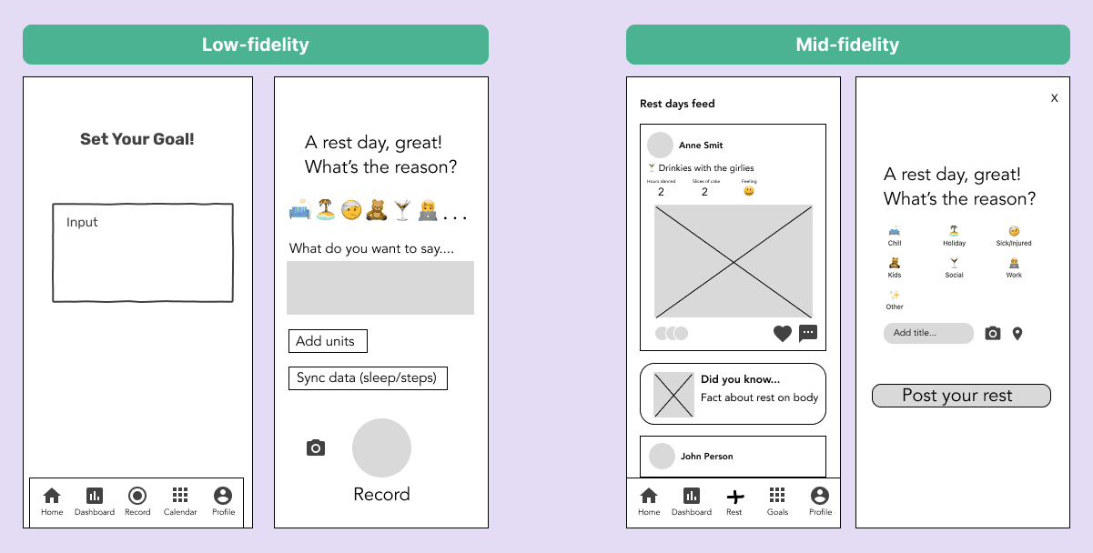
Left: Low-fidelity & Right: Mid-fidelity.
During testing, participants consistently struggled to interpret how the data was visualised on the dashboard. Many found it confusing or lacked context to understand what the charts were telling them. In response, we refined the layout to prioritise clarity, simplifying visuals, adding labels, and using plain language explanations. Given more time, we’d like to dive deeper into this area through targeted user research to better understand what specific insights users want from a dashboard like this, and how they prefer to consume that information.
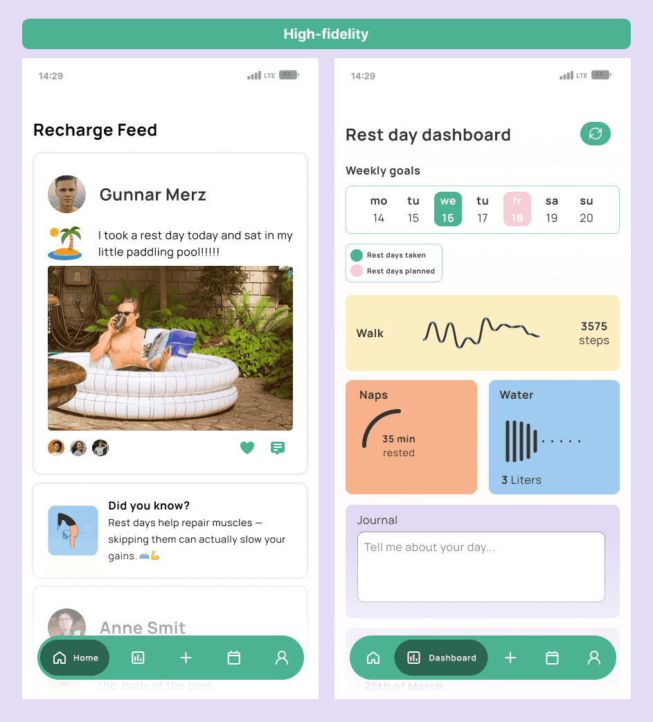
High-fidelity screen design of feed and dashboard screens.
Prototype
Using Figma, we developed a high-fidelity prototype that brought our concept to life. This prototype allowed us to test our ideas in a real-world context, making refinements based on user feedback before moving forward with final iterations.
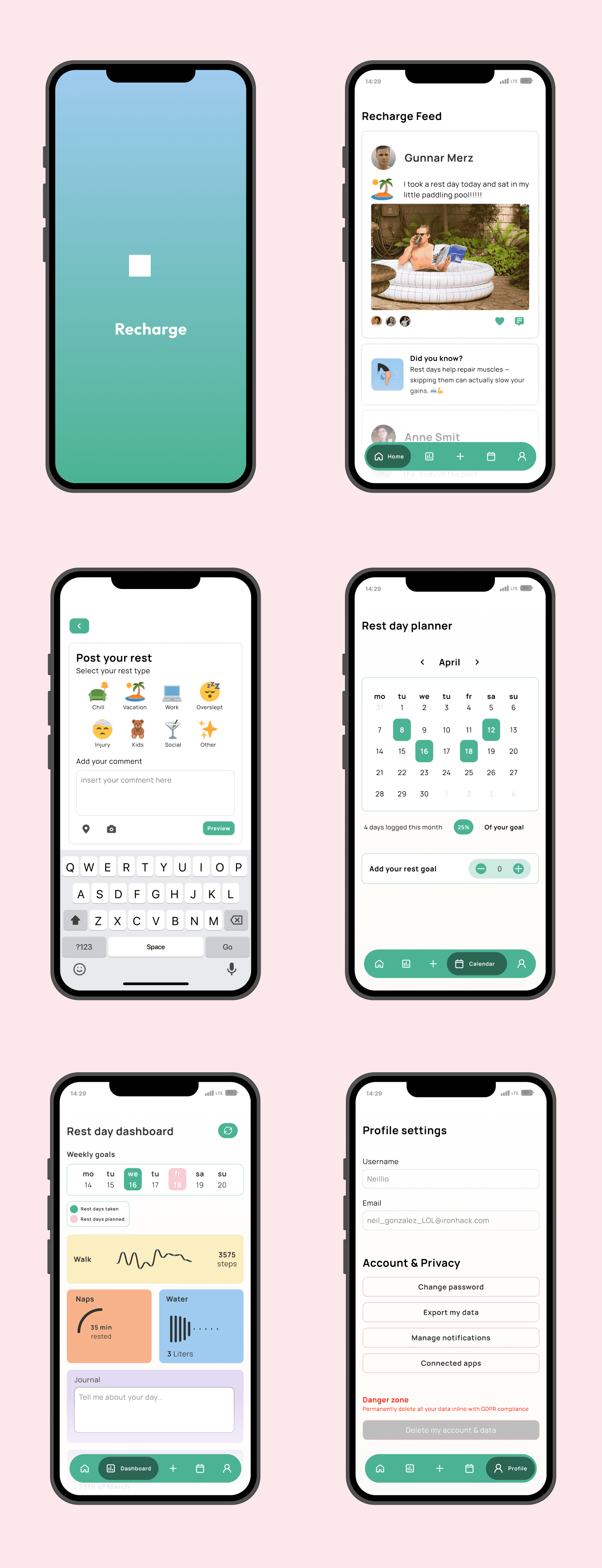
Below you can see the flow of posting your rest day on the app.

Conclusion
Recharge successfully introduced a fresh perspective on rest within fitness, addressing a gap in existing wellness apps.
We identified a couple of key areas for future improvements:
🛠️ Usability & Functionality Enhancements
Usability testing highlighted areas that require refinement, particularly the dashboard’s clarity and integration with existing health apps.
Future iterations should focus on improving functionality, ensuring rest tracking is as intuitive and meaningful as workout tracking.
📈 Expanding research for a more inclusive user base
Our research sample primarily included highly active individuals (4+ workouts per week), which shaped the tool’s initial design.
Broader research is needed to understand how less active users, or those recovering from injuries, might engage with the app.
👁️ Visual & Experience Design Improvements
While we focused on strong UI/UX foundations in Figma, we see opportunities to elevate Recharge’s visual identity further.
Future iterations can refine the aesthetics and enhance the overall experience, making the app more engaging and accessible.
What I learned
This project pushed me to unlearn a lot. At first, I caught myself defaulting to the typical fitness app formula — track workouts, chase streaks, push harder. It wasn’t until we did the “Worst Ideas” brainstorm that I realised how stuck I was in that mindset. Re-framing rest as a goal instead of a compromise shifted not just our design, but my own thinking.
Collaborating with James also taught me a lot about playing to strengths — I leaned into user research and UX structure, while he focused on refining UI details. One of the biggest challenges was staying open to change. There were moments when our early ideas didn’t hold up during testing, and it would’ve been easy to double down. But learning to adapt based on feedback — that’s what made the work better, and made me better too.
This sprint also strengthened my collaboration and communication skills. Working in a small team meant we had to stay aligned and move fast. I learned how to delegate, give and receive feedback constructively, and stay flexible when unexpected changes came up. These are the habits I’ll carry into every future project — they’re just as critical as the design itself.