Fork Ranger (WIP): Scaling Impact through UX/UI design
Fork Ranger is tackling climate change through food, making climate-conscious eating simple and accessible. They use data and storytelling to guide people toward more sustainable choices, and turn that into action through easy, practical recipes.

My role
I work as a retained product designer, putting in a few hours each week on new features for the Fork Ranger iOS app. I'm accountable for the user experience end to end, from the first research question through to what actually ships — making sure it's intuitive, works as intended, and moves the app toward what Fork Ranger is trying to do, rather than just adding a feature for its own sake.

How we work
We run a flexible, feature-focused sprint process to keep the app moving: Task selection; we pick 1-3 high-impact tasks straight from the backlog, managed in Linear, and stay strict about focus so results stay measurable. Sprint length; sprints run 3-4 weeks, enough time to go from concept through design to developer handoff. Defining the MVE; for every new feature, we work out the Minimum Viable Experience: the essentials needed to get it live and testable, nothing more. Prioritisation; two things drive those calls, design and build speed, and technical feasibility. We aim for the fastest path to launch that doesn't gut the feature's usefulness, then collect feedback on version one and iterate from there.
Building a recipe filter
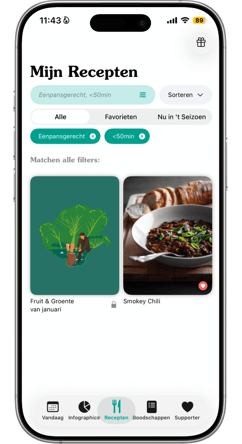
Challenge. Users had been asking for a filter for a while, but the app only had basic sorting. The challenge wasn't just technical; it was defining the right filtering logic. We needed to get past assumptions and understand how people actually decide what to cook, and which criteria, ingredients, time, preferences, actually drive that decision. Solution. We ran a survey among active users to understand their decision-making, then did a competitive analysis of similar apps to see how others had solved it. That research shaped the structure behind the filter, so the options on screen matched how users already think about choosing a recipe rather than how the database happened to be organised internally. During design, I put most of the effort into the edge cases, since those are usually where a filter feature actually falls apart in practice: what the screen shows when a filter returns no results, and how the search bar should behave once someone's stacked several ingredients at once. We also drew a scope line early, features like "plan to cook" were left out of this round, since they weren't essential to getting a working filter in front of users and would have pushed the timeline out for little added value. Result. The filter that shipped puts the most-used categories first, based on what the survey actually showed people care about, and handles both normal search and the empty-result case without leaving users stuck. The images below show the process.